Since MMXIII
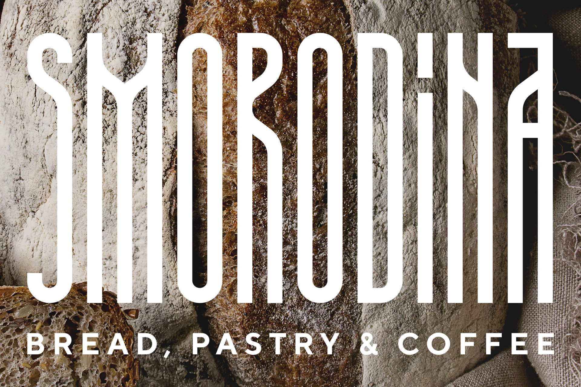
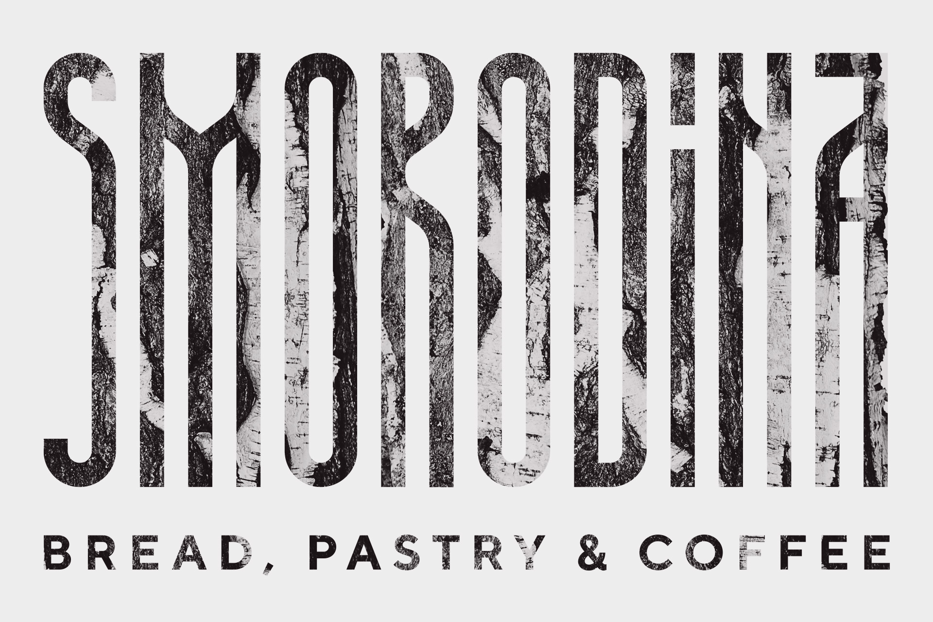
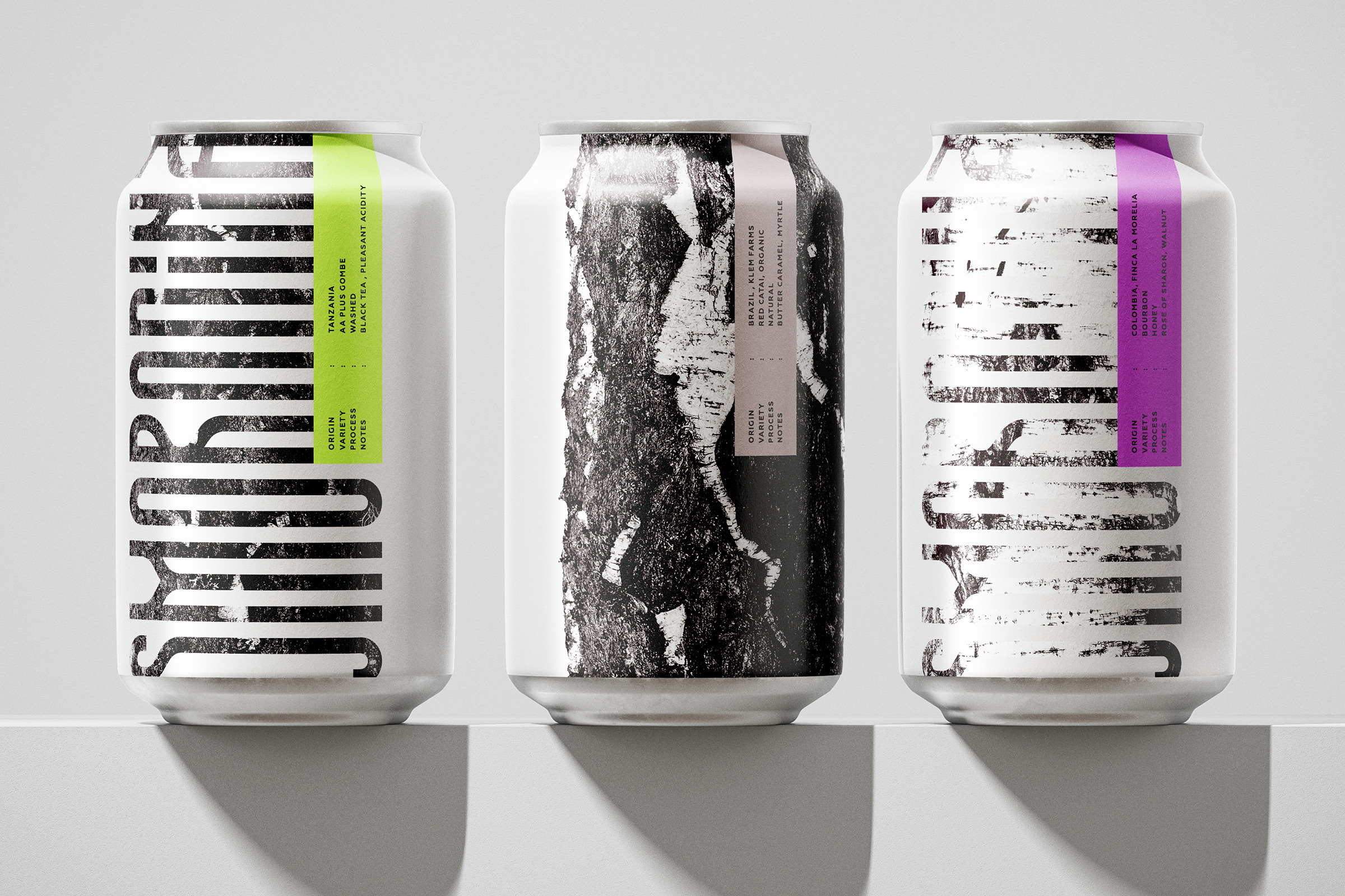
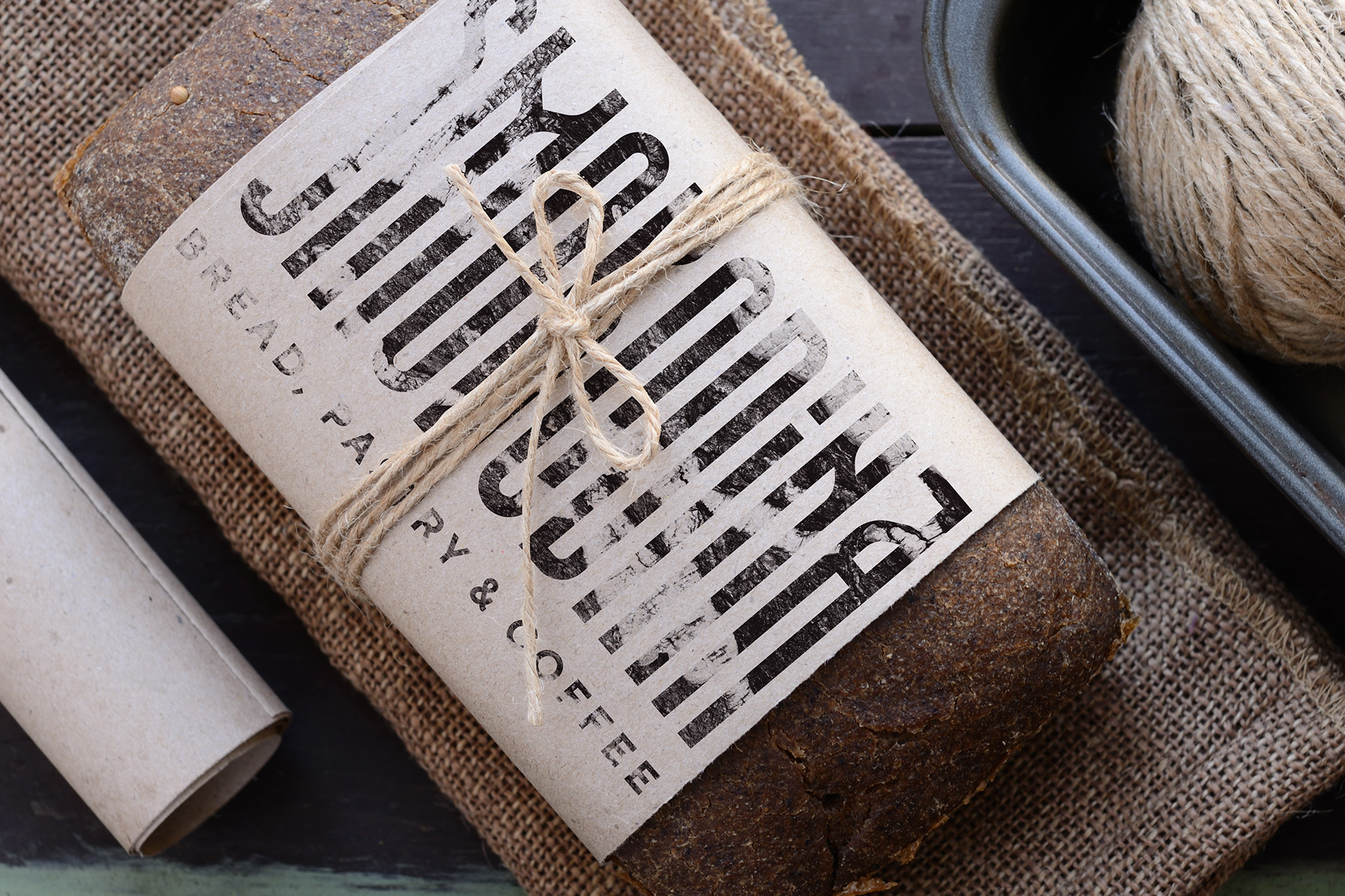
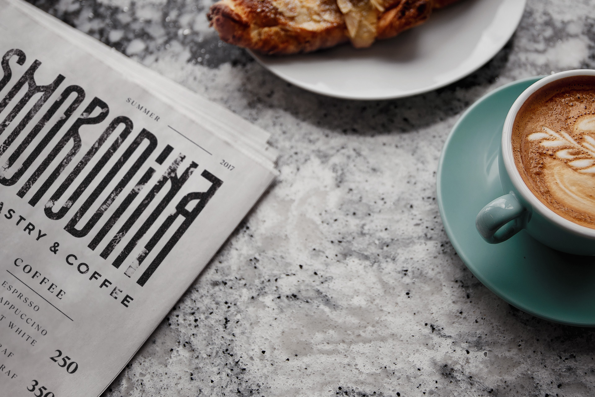
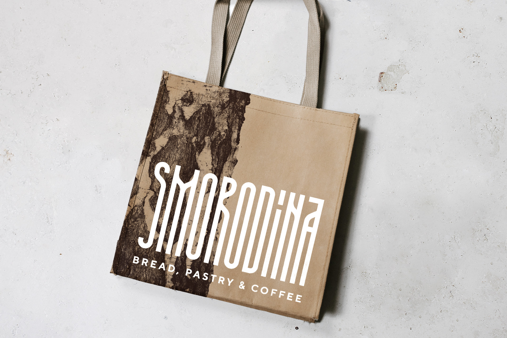
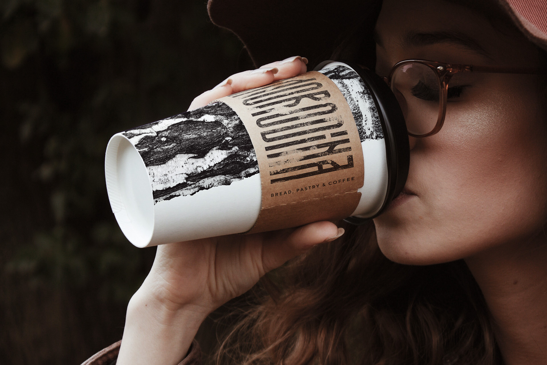
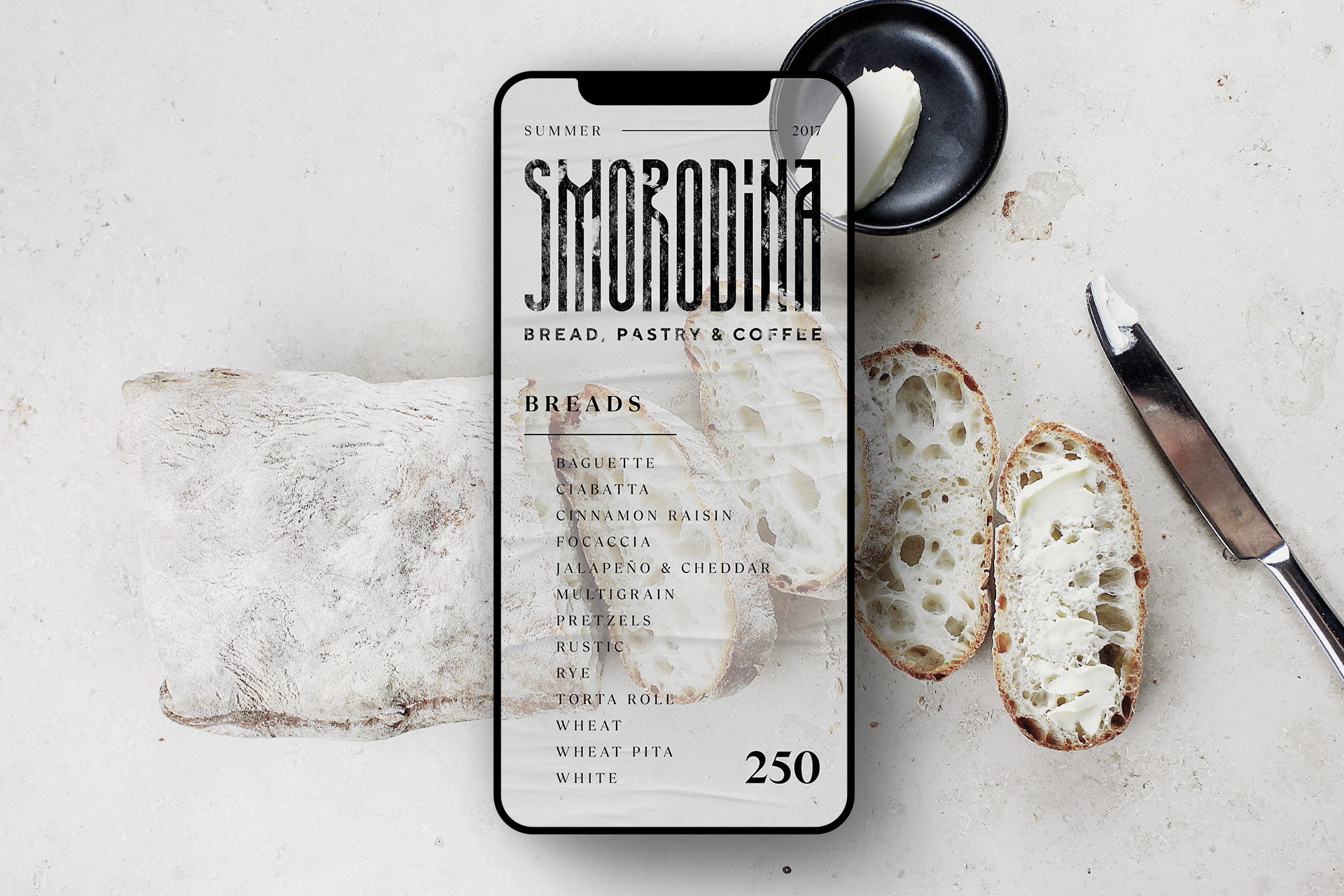
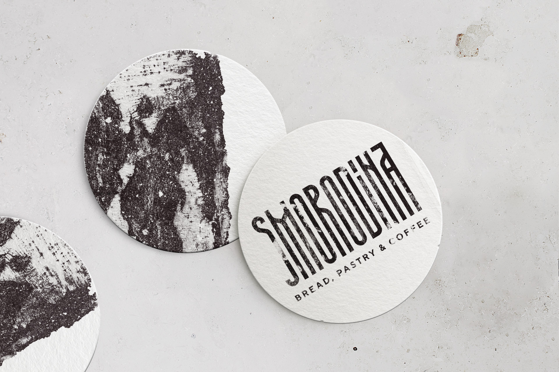
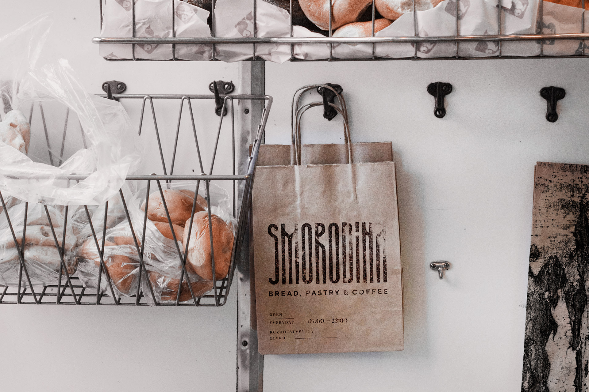
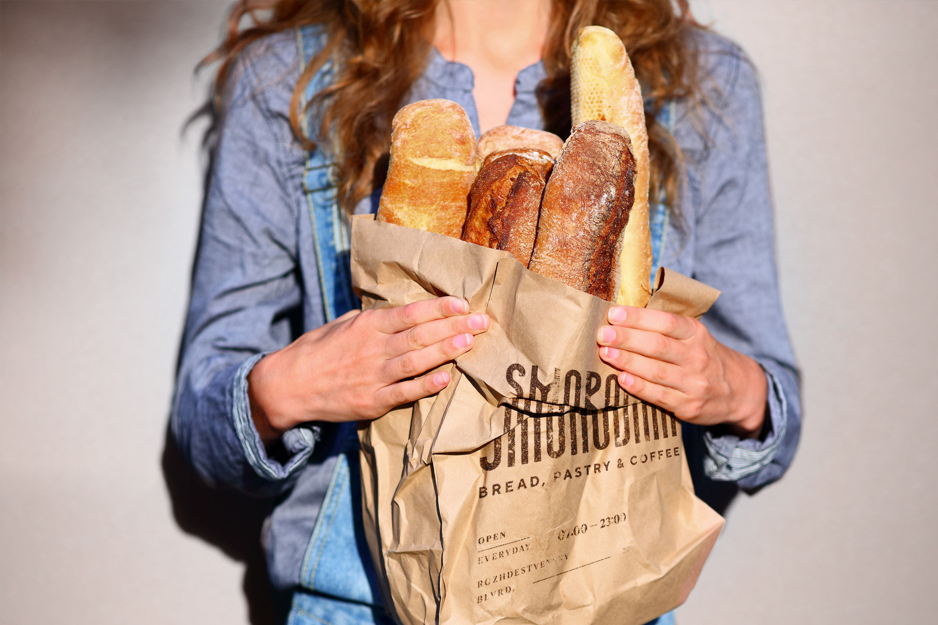
SMORODINA. COFFEE & BREAD
Specialty coffee shop
The nineteen were approached to create a minimalistic, even abstract, nordic and monochrome identity for a specialty coffee shop and bakery, feauturing the essence of russian north.
We built a concept around unique logotype mixing contemporary style with the elements of a traditional russian lettering style. supported by the texture of a birch bark, it creates a bold, restrained yet powerful presence for the brand.
WANT TO TALK ABOUT YOUR BRAND?
GET IN TOUCH NOW.
EMAIL: hey@nineteen.design
WHATSAPP: +995599933153